Role
UI/UX Designer
Deliverables
UI/UX Audit
Website design
Client
flowww
About
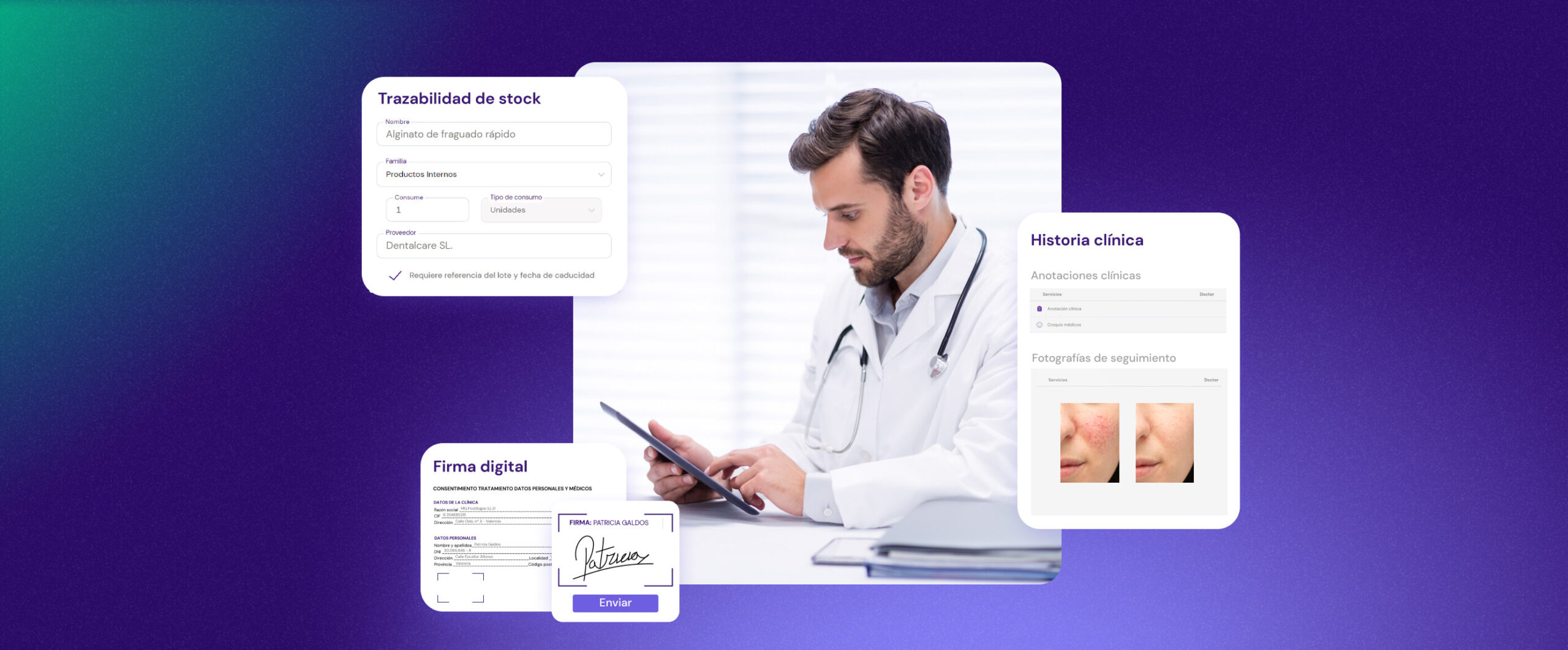
flowww is a management software for the beauty and wellness industry. It streamlines operations with tools for scheduling, CRM, inventory and automated marketing. All of this allows to enhance business efficiency and customer engagement.

Challenge
Manage the information overload while making sure the flowww software is clear enough and it doesn't cause unnecessary questions in the user.
Process
First: audit the website, talk to the client and users so we can identify the main issues. Then we could start the redesign process.
The great thing was that flowww already had a solid branding so we could focus on reshaping the information architecture.
Result
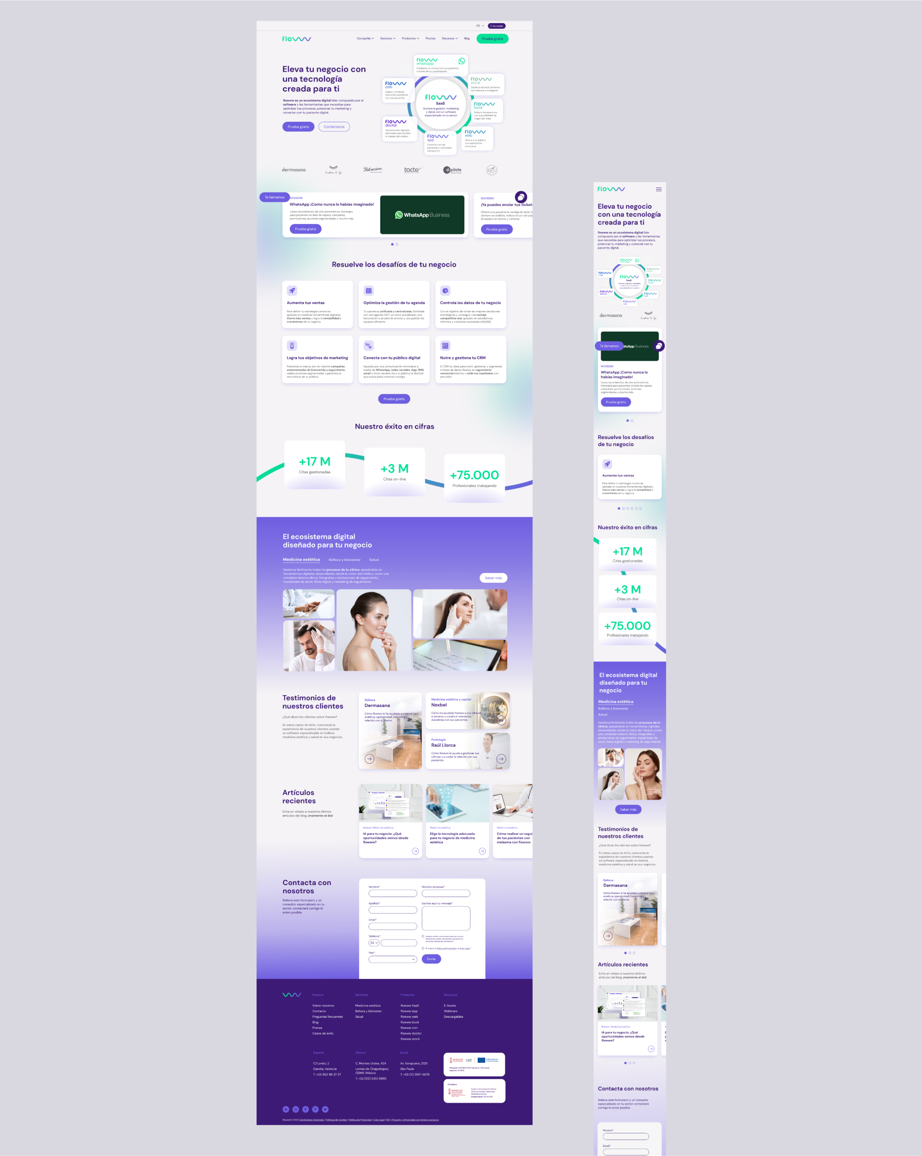
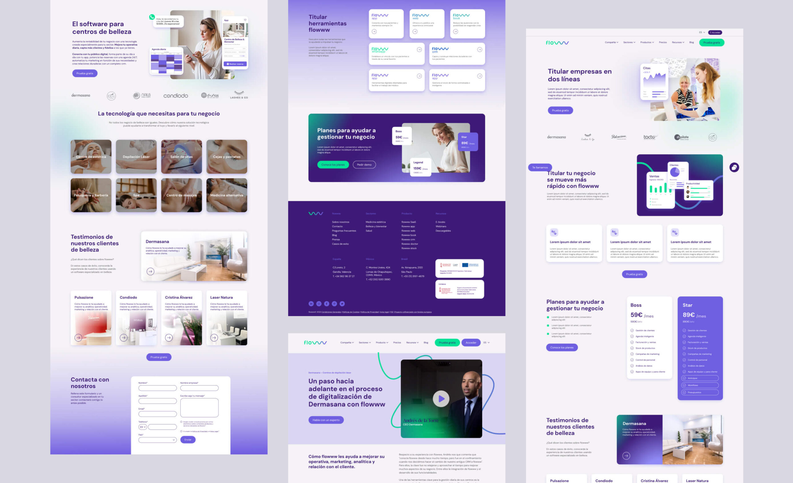
A clearer and more effective website, with information shown in a structured way that made more sense to the user that wasn't familiar with the software.
UI/UX audit takeaways
- Clarity and navigation: the homepage introduces Flowww’s features, but the value proposition feels vague for new users. Key CTAs often lead to unexpected sections, creating navigational inconsistencies.
- Functionality and information accessibility: product explanations on the pricing page are unclear, especially for add-ons, leading to confusion. Important elements like the “Request Demo” button are not highlighted
- Content structure and visual organization: some pages lack scannable formats, with dense text blocks affecting readability. The design style also varies across certain pages, breaking visual consistency.
- Form usability: gorms lack clear visual cues, especially for dropdowns, and error messages aren’t distinguishable, making corrections harder for users.
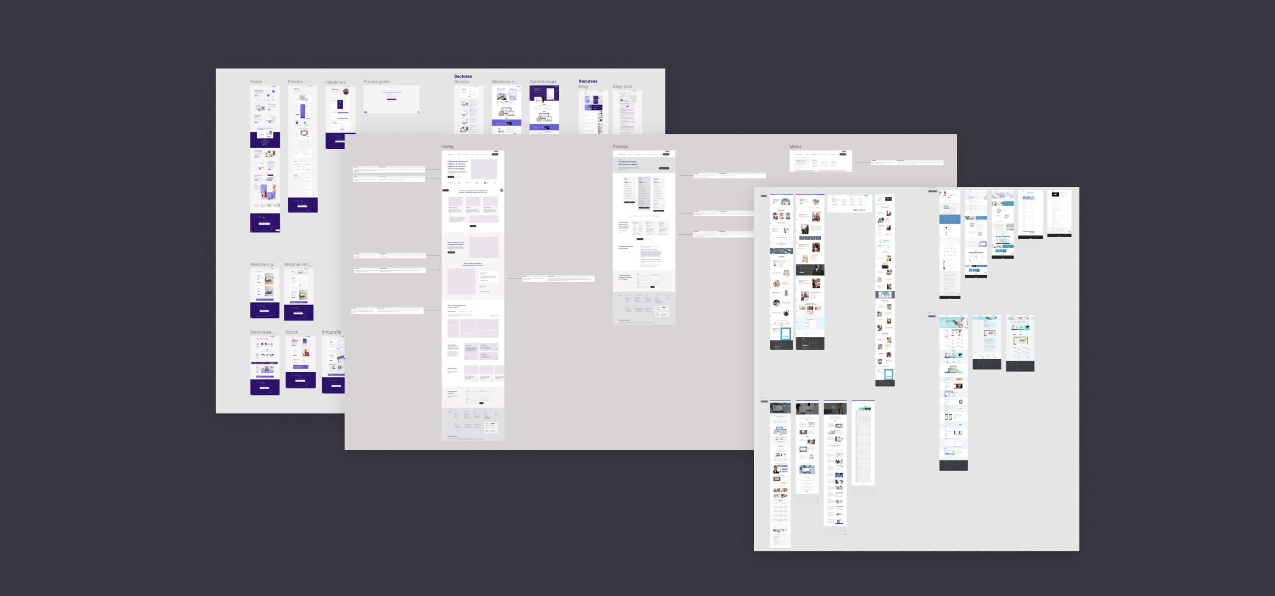
With those conclusions, I wireframed the two main pages that had the most issues: the home and pricing, showing the client a proposal on how they could be solved.
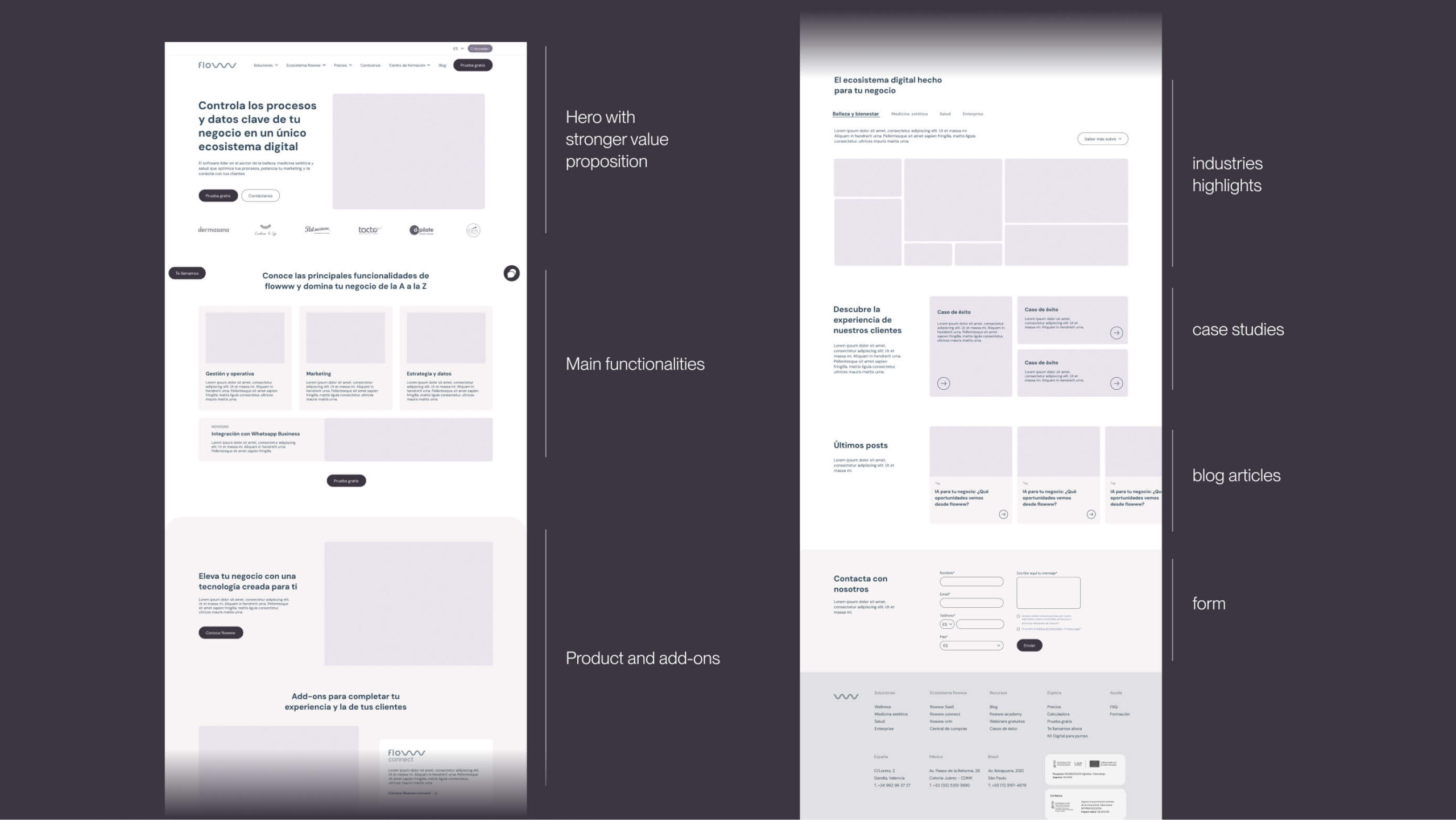
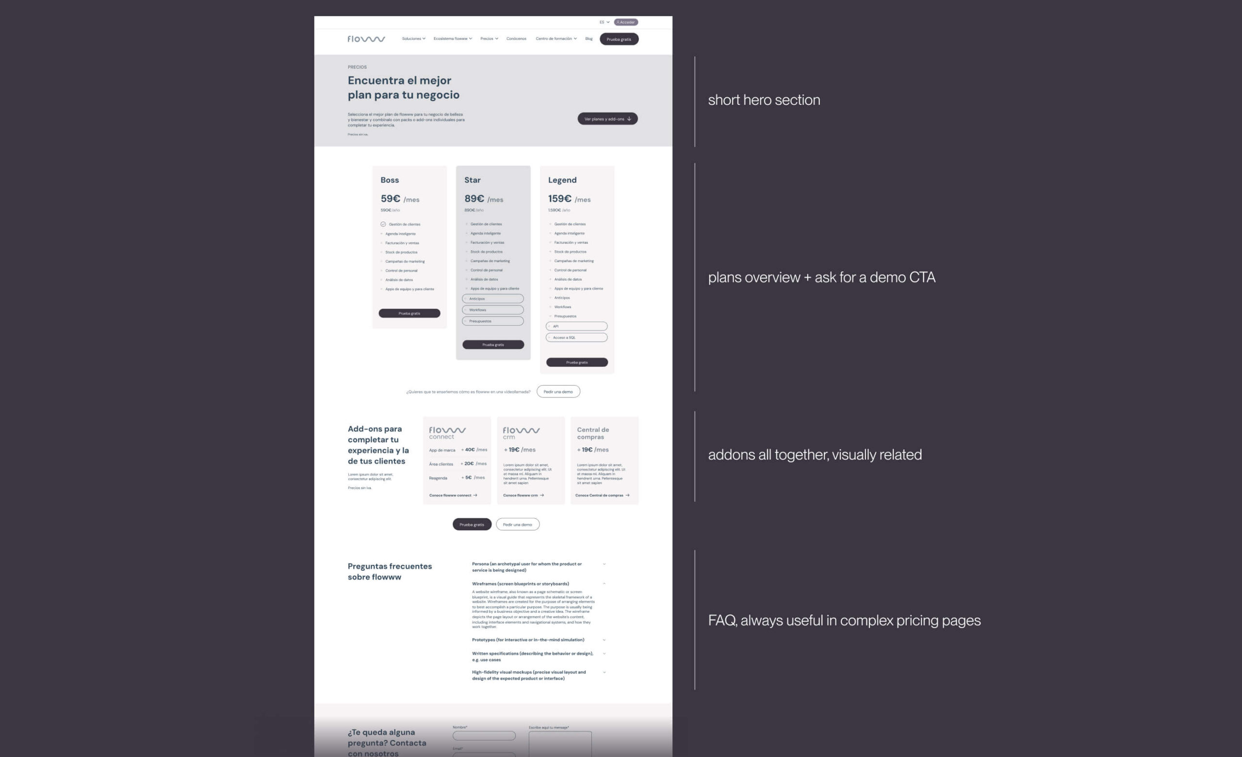
After some rounds of feedback the home design was ready and the same excersice was done in all of the pages.
