Role
Deliverables
Client
About
Cabify is a ride-hailing platform offering safe, efficient, and sustainable transportation solutions for users and businesses.
Challenge
Optimize two key pages for business (Contact and Webinar) for higher conversion rates by improving user engagement and attention focus.
Contact Page
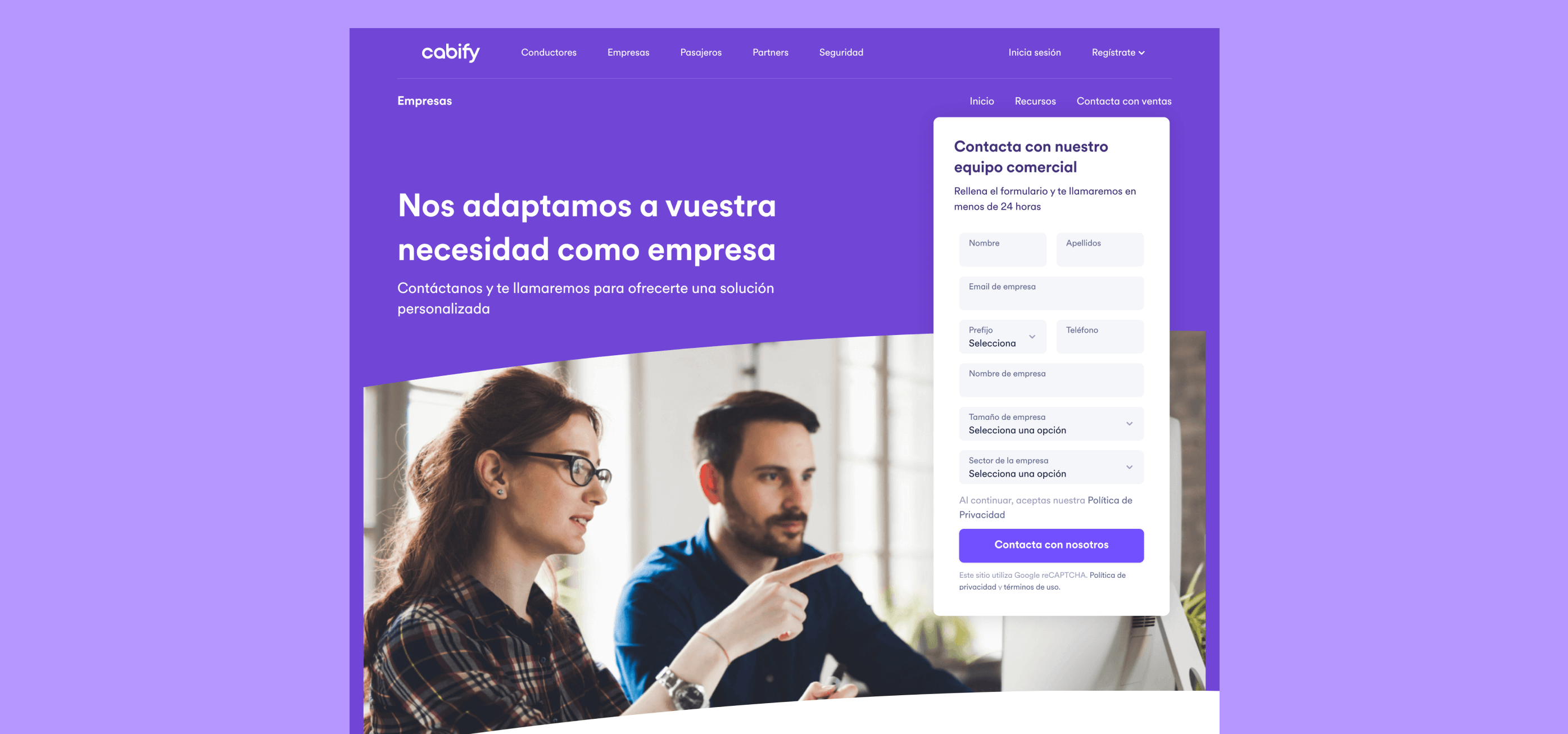
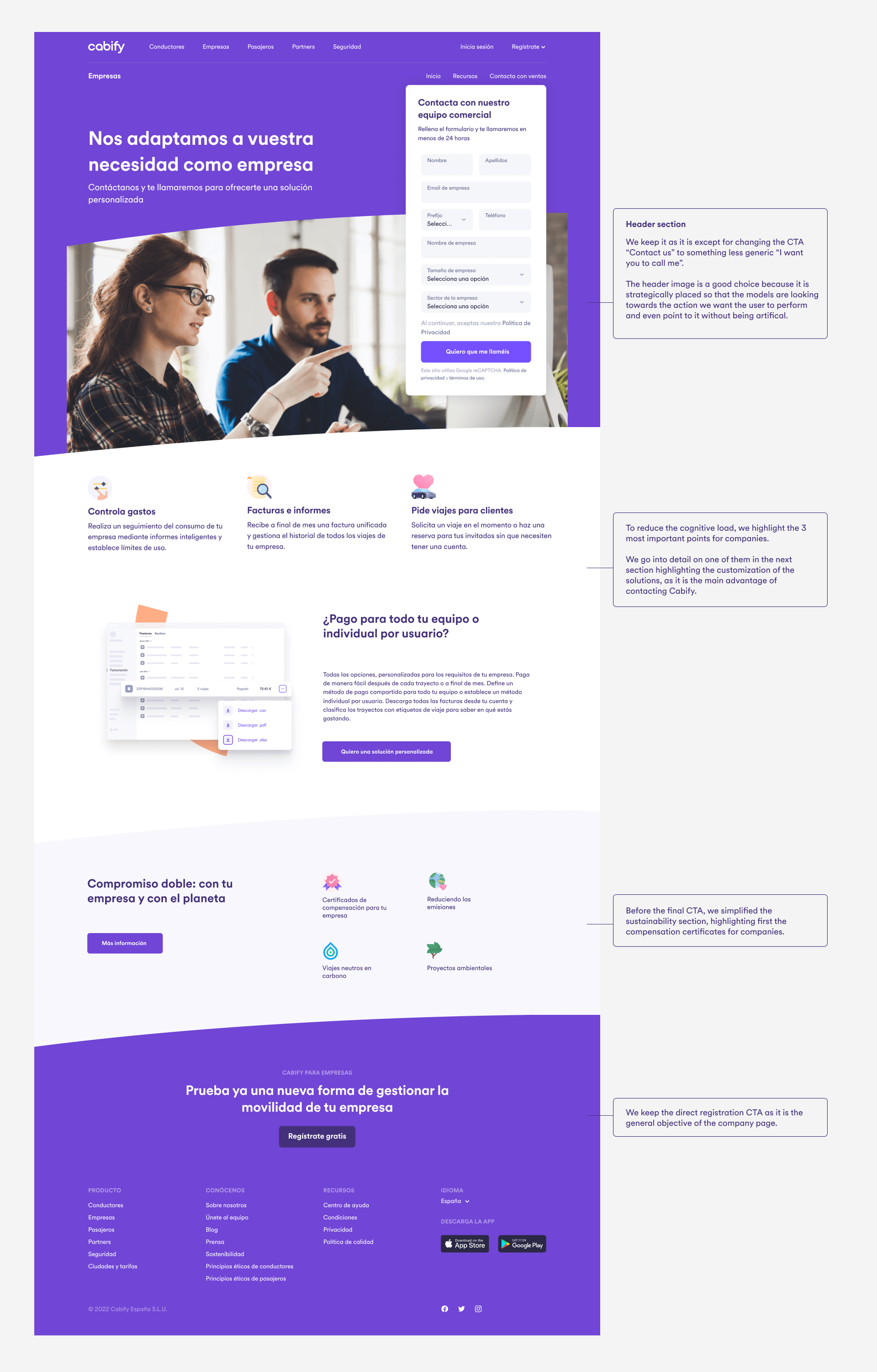
The goal of this page is to show users how to contact Cabify and highlight the main benefits for business representatives, encouraging them to request more information.
Users of this page know the Cabify brand for consumer use but may be unfamiliar with its business solutions. Therefore, the page aims to highlight key points of this service, creating a need to learn more about personalized solutions.
Analysis – Desktop
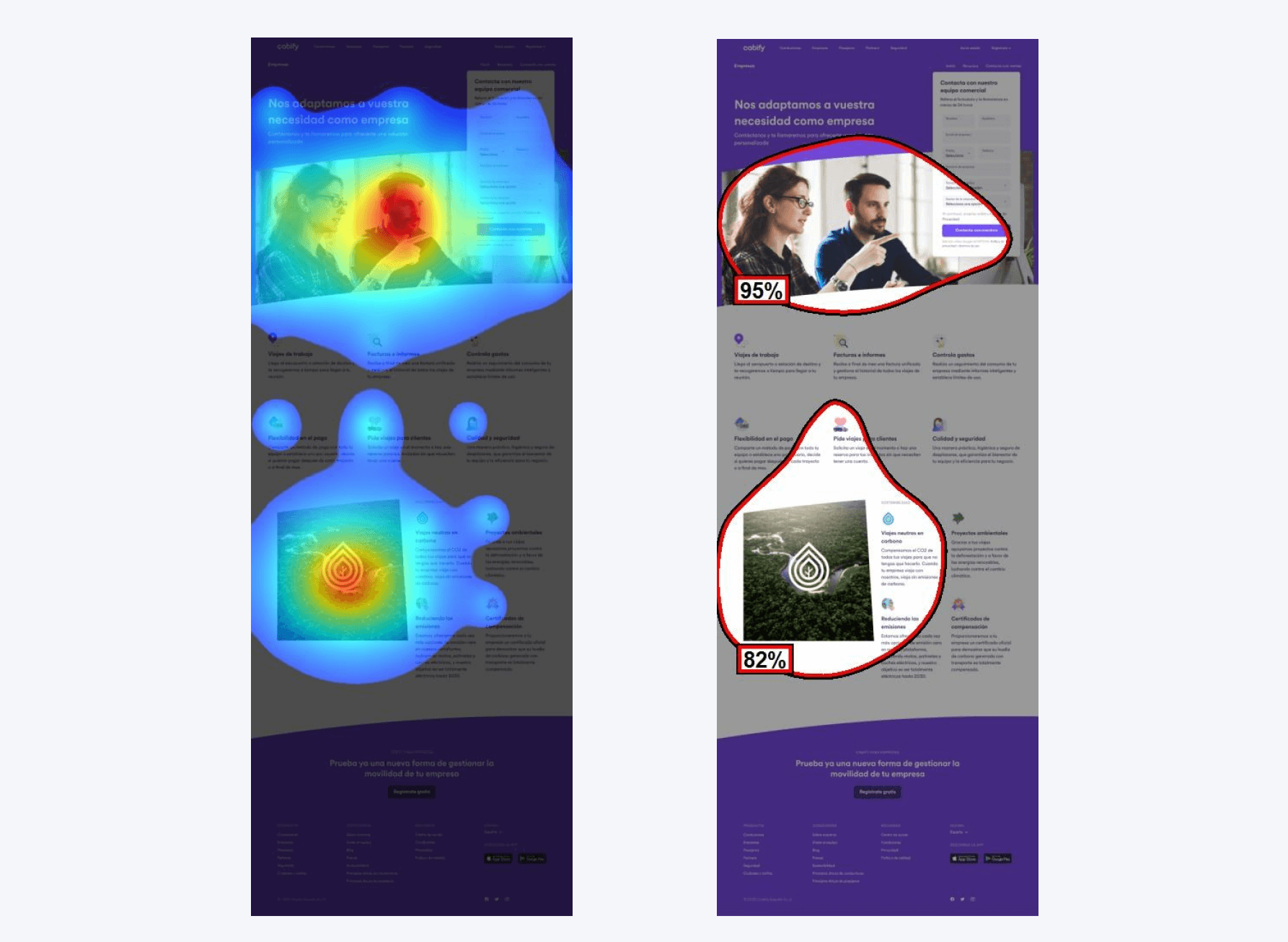
Above the fold composition is correct, drawing attention to the CTA (form). However, further down, attention becomes scattered, with no clear focus on any CTA. Large blocks of text lack a visual hierarchy to guide users through the page.
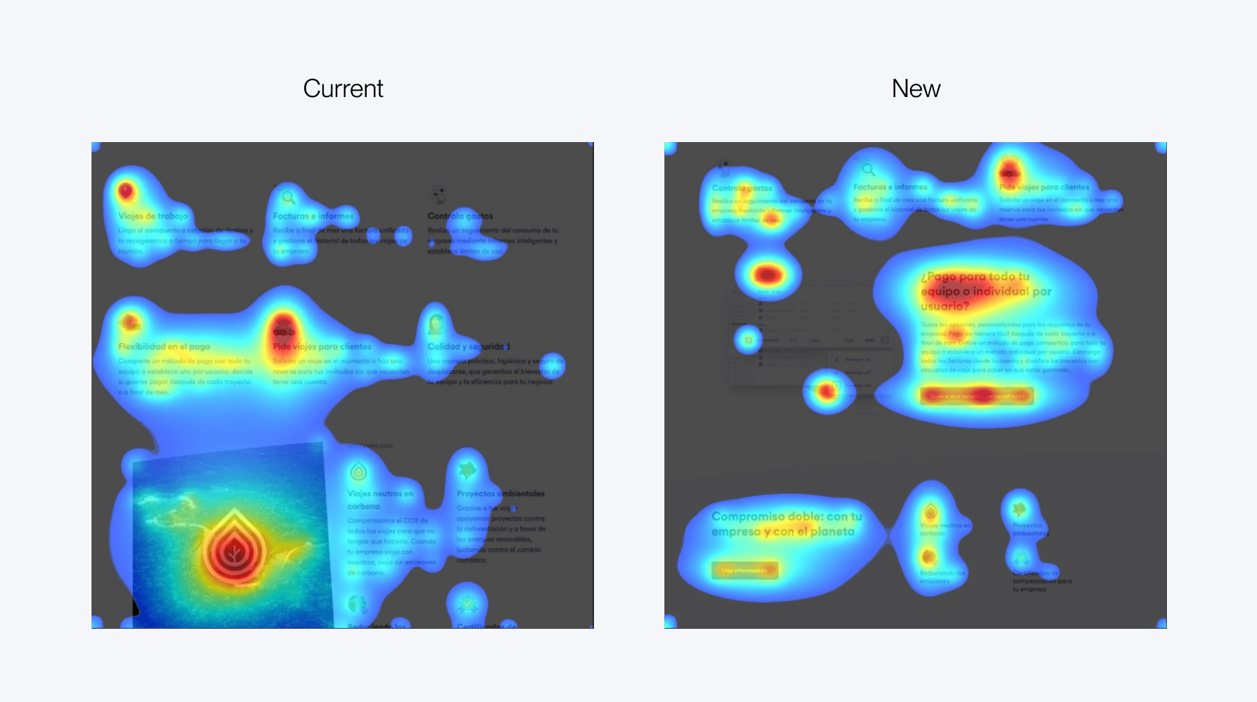
Attention is mostly on the header image and the CTA, which it’s positive. But another focal point is the sustainability image, which doesn’t add informational value or guide users to the form.
We propose:
- Reducing text and highlighting key advantages intentionally
- Detailing specific points to reinforce the message of personalized solutions;
- Including CTAs that lead to the form throughout the page.
Analysis – Mobile
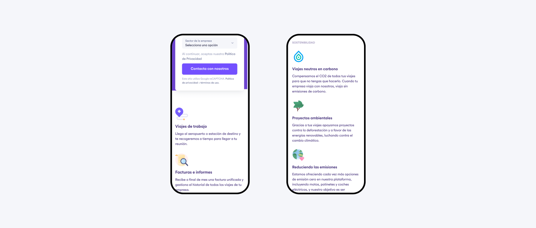
The issues on desktop are more prominent on mobile due to limited space, leading to a long and monotonous scroll, particularly in the icon+text blocks.
We propose:
- Adapting desktop suggestions to vary the structure and avoid monotony
- Adding a sticky CTA that follows users as they scroll.
Comparative
Main issue: lack of focus in the second and third sections.
In the proposed version, user attention shifts from images to CTAs across the page. This refocuses user actions on form completion, enhancing conversion potential.
Webinar page
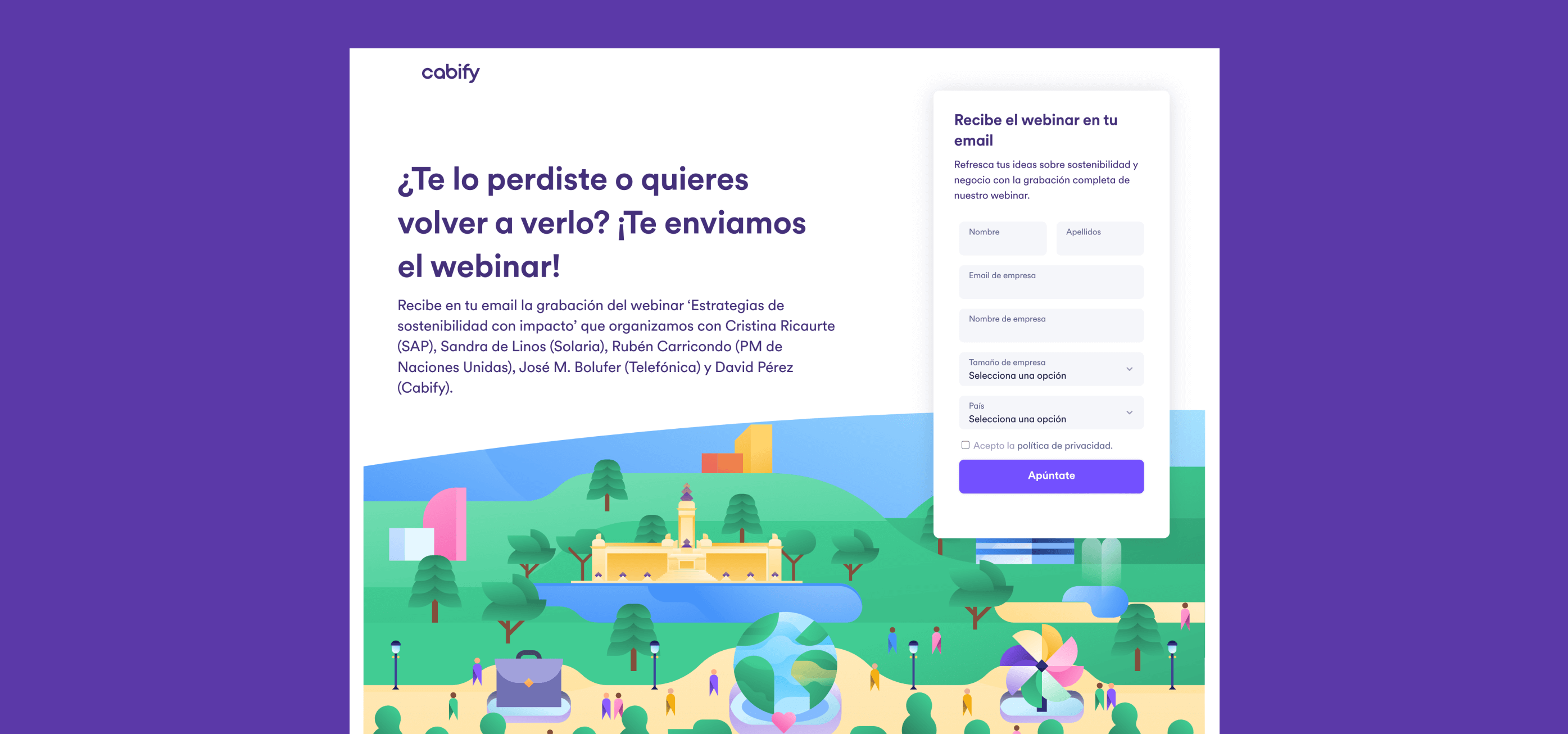
The goal is to present users with information about the webinar, encouraging them to download it.
Users are interested in the topic and want to know more. By focusing on the speakers, we aim to persuade users to complete the form and dive deeper into the topic with the help of experts.
Analysis – Desktop
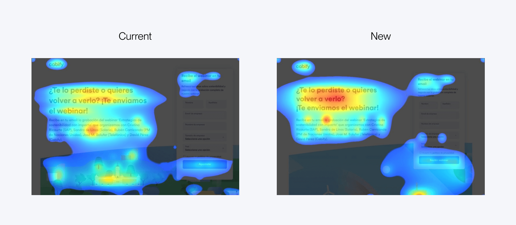
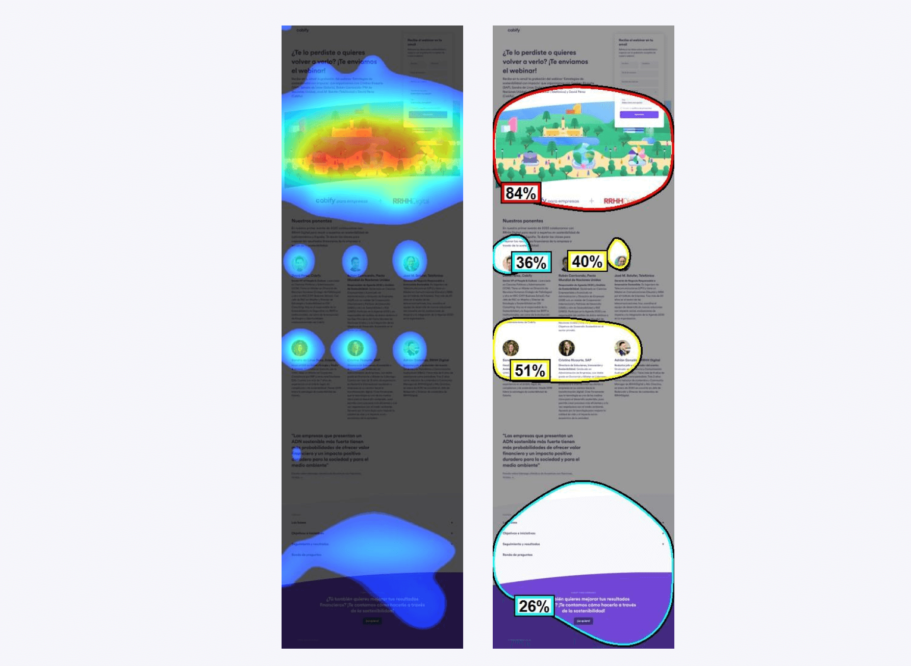
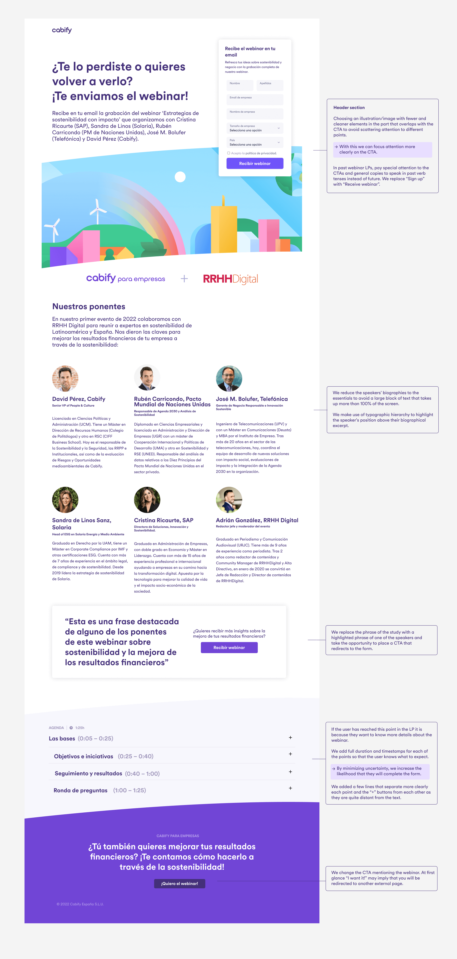
The above the fold composition centers user attention on the illustration, which is complex and distracts from the CTA, making it less noticeable.
The recommendation is to simplify the illustration to better focus on the main goal: completing the form.
No CTAs guide the user to the form during scrolling; there’s only one at the page’s end. We recommend adding a CTA after the speakers section to capture user attention.
Analysis – Mobile
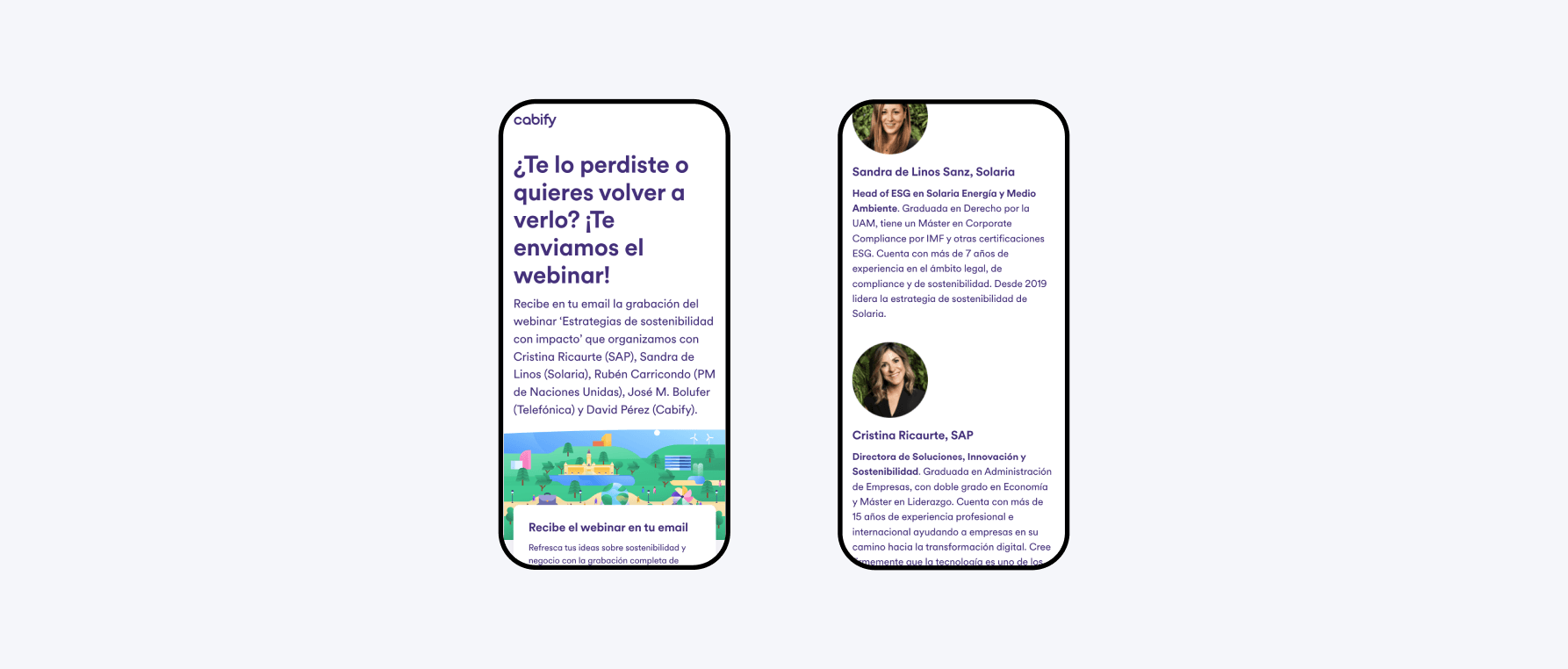
The speaker section is lengthy due to copy size, resulting in extensive scrolling.
We suggest:
- Using a carousel for the speakers section
- Adding a sticky CTA to keep the desired action visible.
Comparative
In the proposed version, attention shifts more toward the CTA rather than the background illustration. This reduces cognitive load above the fold, increasing the likelihood of users completing the desired action.
